On Mapping the Varieties of Risk
Monday, August 6th, 2018[ by Charles Cameron — a theoretical question or suggestion, with serious or curious personal implications ]
.
This will get personal, but I’m aiming for a question or suggestion regarding the mapping of risks, in terms both of human life expectancy and of any and all other forms of risk assessment.
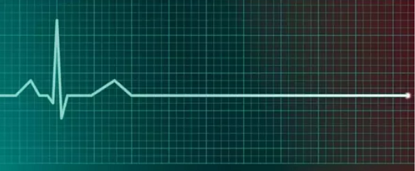
moments to flatline — but enough of that
**
Well, well, I guess some predictive nethods may be better than others. Prophecy has the divine seal of approval, so there’s really no contest except When Prophecy Fails, as Festinger had the audacity to suggest.
Fallback methods, in that event, include prediction, medical prognosis or actuarial life expectancy, mortality or maybe just morbidity, fortune-telling of various sorts — cookie, cookies, tellers, aura readings, tarot..
And for myself, personally, there are various levels of risk that if mapped together would provide a graph with several nodes — to name the obvious, geopolitical risk, life expectancy, expectancy without dialysis, and bleed out.
**
Let’s takee a stab.
By geopolitical risk I mean roughly what the Doomsday Clock of the Bulletin of the Atomic Scientists implies — not the time in minutes to Doomsday, but the risk that we’ll be fried in the next year or eight, three, fifteen.. forty-eight.
The year just past proved perilous and chaotic, a year in which many of the risks foreshadowed in our last Clock statement came into full relief. In 2017, we saw reckless language in the nuclear realm heat up already dangerous situations and re-learned that minimizing evidence-based assessments regarding climate and other global challenges does not lead to better public policies.
Eight years or forty-eight?
Let’s hope Doomsday’s a long time coming, or indefinitely postponed.
**
Life expectancy:
actuarial life table simplified, simplified
Zeroing in, there’s my life expectancy / prognosis. A couple of years ago, a physician friend gave me (informally) fifty-fifty odds of living the year out, and revised his guesstimate upwards as the year inproved my condition. Okay, five years would get me to eighty, which considering my state of health (morbidity) may be a bit optimistic (mortality). I’ve heard of people on dialysis for sixteen years, and then there are those who get transplants..
But if for some reason, my access to dialysis was cut off, I’m told I’d have eight to maybe twelve days — and Russians toppling the grid, or the President and Congress pulling appropriate insurance might switch me from optimist to Soli Deo Gloria
— in double quick time.
**
And then there’s arterial bleed out, against which precautions are believe me taken. A minute? four? The equivalent, perhaps, of stepping on a jumping jack in Afghanistan? Kiss your Self goodbye.
**
So a number, a length of time, can be assessed for any one of these, and when people who study in the assessment of risk can give that number, backing it up with whatever persuasions they find appropriate. A number. 50-50. Three years. By my calculation, the Book of Revelation. By their calculation, the Doomsday Clock of the Atomic Scientists. What, as the younglings say, ev. But a single number, or more expansively, range.
But here’s my question: does anyone have a graphical method for mapping all the variants of risk, say the ones I listed for my personal case?
It feels a bit like a ratcheted system – failing death by nuclear annihilation or Yosemite blowing, there’s my prognosis, hopefully a matter of years. That can jum suddenly to days in the grid goes don (think Puerto Rico) — and leap toi a handful of minutes if, Black Swan forbid, a procedure fails and I’m unexpectedly bleeding out.
So does anyonbe make ratcheted graps of how one risk slips to another?
soli
**
>And my suggestion, if nobody has such a mapping scheme that I could give a look-see to, is that we should think about how to make such a mapping systen=m available.
Thank you for reading, considering, responding to question or suggestion.


