zenpundit.com » Sembl

Archive for the ‘Sembl’ Category

On the felicities of graph-based game-board design: twelve

Friday, March 23rd, 2018

[ by Charles Cameron — Cambridge Analytica and Guardian logos, HipBone Game boards ]
.

A while back, I posted a series of pieces about the felicities of graph-based game-board design. This piece picks up from that series, with a bit of a refresher, and a pointer to the Cambridge Analytica logo.

First, the question arises of what graphs are. A graph, from a mathematical point of view, consists of nodes and edges: nodes are, in this diagram, the red circles, and edges are the lines connecting them:

We know a great deal about the mathematics of graphs, but they underlya vasst repertoire of modern systems, including — for an extreme. complex instance — the design of washing machines:

**

Back at least to medieval times, graphs can be found with concepts assigned to their nodes and the reasons connecting those conceptts assigned to their edges. These thre show one Jewish (Kabbalistic) conceptual graph, one graph of the four elements and their relaations, and a Christian ttrinitarian graph:

I have usedsc similar conceptual graphs as the boards of my HipBone Games. SHown herear ethree of my boards, together with a spiffy board by my friend and colleagues Cath Styles for her Sembl games:

**

All the above, to show you why all usees of graphs are potentially of interest to me, and why I am particularly interested in the Cambridge Analytica logo (left, below), which offers a graph in the shape of the human brain, and the logo the Guardian devised (right, below), to give visual continuity to their articles about Cambridge Analytica;

I think you can see how the Guardian logo would make a fine HipBone game board for teen Agatha Christie -type games.

**

Hey, on complexity — which graphs and diagrams are better at than “linear” verbal explanations — there’s this — not a graph! — from another post of mine — wow!:


Shaping strategy — Constant turbulence and disruption

**

Earlier in this series:

  • On the felicities of graph-based game-board design: preliminaries
  • On the felicities of graph-based game-board design: two dazzlers
  • On the felicities of graph-based game-board design: three
  • On the felicities of graph-based game-board design: four
  • On the felicities of graph-based game-board design: five
  • On the felicities of graph-based game-board design: six
  • On the felicities of graph-based game-board design: seven
  • On the felicities of graph-based game-board design: eight
  • On the felicities of graph-based game-board design: nine
  • On the felicities of graph-based game-board design: ten
  • On the felicities of graph-based game-board design: eleven
  • Face to Face, Google-style reSemblance

    Tuesday, January 16th, 2018

    [ by Charles Cameron — cross-posted from Sembl.net ]
    .

    Google, apparently, has an app that some people, apparently, believe responds to a selfie with a same-looking portrait from one of the world’s great museum collections. It is, in short, a Sembl-like app for faces. Uh-oh.

    The Washington Post titled their piece on the topic Somewhere in the world, there’s a painting that looks like you. And Google will find it.

    Though the Google Arts & Culture app has been available since 2016, the find-your-art-lookalike feature was released with its latest update in mid-December. …

    “We’re always trying to figure out cool and interesting ways to get people talking about art, and this was one of them,” Lenihan said.

    In recent days, scores of people — including plenty of celebrities — have shared their often hilarious results on social media, helping Google Arts & Culture climb the App Store’s charts to become the most downloaded free app.

    **

    I thought most of the examples shown disproved the assertion in the WP post’s title. TThe museum items Google suggested didn’t look anytthing like the selfies people had submitted. My apologies. Until I saw Sarah Lyn Rogers‘s tweeted example:

    **

    Sembl! That really does strike me as a fine case of resemblance!

    On the felicities of graph-based game-board design: ten

    Sunday, October 9th, 2016

    [ by Charles Cameron — a long, lazy Sunday post, packed with quirky interest and neat maps ]
    .

    Ten? What’s so special about ten, hunh? Just because you have ten fingers, you suppose that makes ten special?

    **

    One:

    As simple as a map can get:

    worry-line
    Simon Kirby, The Worry Line
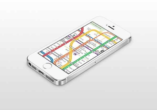
    Two:

    As complex as one can get:

    most-complex-ny
    Eric Jaffe, The World’s 15 Most Complex Subway Maps

    And I mean complex, cognitively complex:

    When it comes to information processing, an average person’s “cognitive threshold” is about 250 connections, or the equivalent of roughly eight bits of data, according to the researchers. New York’s system neared that limit, with 161 total connections, and the most complicated two-transfer trip a person could make on the subway exceeded it—clocking in at 8.1 bits. Maps for the Paris Metro (with 78 total connections), Tokyo Metro (56), and London Tube (48) clustered around six bits of information.

    Three:

    Naked:

    naked-map
    Nick van Mead, Can you identify the world cities from their ‘naked’ metro maps?

    The Guardian wanted to know if you could recognize various cities if shown their metro maps without the stations markings.. and i could manage Chicago (above).

    Four:

    Coffee:

    coffee-shop-mapo
    Chris Ward, Coffee Stops

    Sadly, the map is not the territory, or I could get my Java from South Ken while sitting at my desk just outside Sacramento.

    The London Coffee Map, “Coffee Stops,” was designed by Chris Ward, who calls himself “the boss who works from coffee shops.” He recently published Out of Office: Work Where You Like and Achieve More, a best-selling guide to leading a successful working life outside an office building. Apparently, being properly caffeinated is one of his biggest tips. Now you can grab your joe at local London cafes with quaint names like Scooter and Electric Elephant.

    Five:

    Mug:

    I could then quaff it from an appropriately poetical Map Mug:

    50112-greater-shakespeare-map-mug-normal
    Royal Shakespeare Company, Greater Shakespeare Map Mug

    The map here representing affinities between characters in the Bard’s various plays:
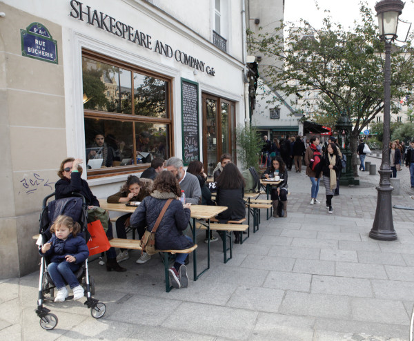
    greater-shakespeare-map-rsc

    **

    Interlude:

    — and we’re half way to ten, let’s imagine ourselves at Shakespeare and Co‘s bookstore and cafe in Paris

    shakespeare-co

    **

    Six:

    Calvino

    While we’re on a literary streak, here’s a thumbnail of one of artist Rod McLaren‘s illuminations of Italo Calvino‘s Invisible Cities:

    italo-calvino-mapped
    Rod McLaren, Invisible Cities Illustrated #2: Trude/Ersilia

    The detail here is fantastic, as befits Calvino’s work:

    The diagram, a network of curved lines connecting to every other node on a 6 x 5 grid, has two configurations: if the picture is hung one way up, it shows the “Ersilia configuration” (where the lines are like the threads strung between the buildings of Ersilia); if hung the other way up, it shows that of Trude (where the lines are like a complicated airline route map).

    Ersilia (Trading Cities 4, p78):

    In Ersilia, to establish the relationships that sustain the city’s life, the inhabitants stretch strings from the corners of the houses, white or black or gray or black-and-white according to whether they mark a relationship of blood, of trade, or authority, agency. When the strings become so numerous that you can no longer pass among them, the inhabitants leave: the houses are dismantled; only the strings and their supports remain. From a mountainside, camping with their household goods, Ersilia’s refugees look at the labyrinth of taut strings and poles that rise in the plain. That is the city of Ersilia still, and they are nothing.

    They rebuild Ersilia elsewhere. They weave a similar pattern of strings which they would like to be more complex and at the same time more regular than the other. Then they abandon it and take themselves and their houses still farther away.

    Thus, when travelling in the territory of Ersilia, you come upon the ruins of the abandoned cities, without the walls which do not last, without the bones of the dead which the wind rolls away: spiderwebs of intricate relationships seeking a form.

    Trude (Continuous Cities 2, p128):

    If on arriving at Trude I had not read the city’s name written in big letters, I would have thought I was landing at the same airport from which I had taken off. The suburbs they drove me through were no different from the others, with the same greenish and yellowish houses. Following the same signs we swung around the same flower beds in the same squares. The downtown streets displayed goods, packages,signs that had not changed at all. This was the first time I had come to Trude, but I already knew the hotel where I happened to be lodged; I had already heard andspoken my dialogues with the buyers and sellers of hardware; I had ended other days identically,looking through the same goblets at the same swaying navels.

    Why come to Trude? I asked myself. And I already wanted to leave.

    “You can resume your flight whenever you like,” they said to me, “but you will arrive at another Trude, absolutely the same, detail by detail. The world is covered by a sole Trude which does not begin and does not end. Only the name of the airport changes.”

    All of which reminds me of nothing so much as Antonio Gaudi‘s model — made of hanging chains — catenaries —

    inverted-model-barcelona

    which when turned upside down provide the structure for his Sagrada Familia cathedral in Barcelona:

    sagrada-familia

    Seven:

    Ghost:

    Meanwhile, back in London, we have maps of the ghost (ie abandoned) London tube stops:

    ghost-stations
    Dylan Maryk, Ghost Stations On The London Underground

    Eight:

    That’s one way to de-clutter the Tube map — show what ain’t there any more.

    Here’s another —

    declutteredtubemap
    Matt Thomason, 150 years of The London Underground

    Don’t ask me what it means — seeing as Hugh Grant gets a station, it’s either gentlemanly or ungentlemanly, I’m not sure which.

    Nine:

    Music:

    I simply didn’t know you’d have to travel this far to get from Dylan to the Beatles:

    london_music_genres_detail
    Dorian Lynskey, in Tufte, Response to London Underground maps

    I mean —

    bob-dylan-john-lennon
    Michelle Geslani, The Beatles and Bob Dylan met 50 years ago today

    Ten:

    I’ve kept this one for last because in some ways it’s the subtlest:

    exhibition-in-borders-we-trust

    It’s the work of architect Jug Cerovic., and on his page In Borders We Trust he offers this conceptual comment:

    Borders are primarily a mental construct.

    Just like a deity, they exist only insofar as People believe in them. Question is however how necessary our belief in their existence is and when exactly does that belief start harming us?

    At which point do borders cease to be a convenient orientation marker, a helpful tool for the comprehension of the land we inhabit, a common identifier for the construction of a shared identity? At which point do borders become a dogmatic limitation to imagination, a terrifying prison for the body and mind, a symbol and support of hatred?

    Borders do not possess an inherent bad or good character, on the contrary they are a malleable concept subject to appropriation and interpretation.

    “In borders we trust” examines the perception, physical manifestation and enforcement of the couple formed by People and Borders focusing on three key areas of the contemporary migration routes:

  • Gibraltar
  • Serbia
  • Levant
  • For this purpose the peculiar relationship between Borders and People is illustrated with a sequence of three distinct maps:

  • Borders without People
  • Borders with People
  • People without Borders
  • This novel perspective of a seemingly familiar representation, with each component of the couple shown separately and juxtaposed to their combined illustration, questions the articulation and pertinence of our present predicament.

    Happily, this is an area that I’ve delved into at some length myself in my earlier post, No man’s land, one man’s real estate, everyone’s dream? — with specific reference to ISIS’ bulldozing of the border between Iraq and Syria, and the Basque country, Euskadi, saddling the French / Spanish border.

    Cerovic has achieved an eminently practical limited version of one of my own grandiose castle-in-air schemes — building a universal graphical mapping system. Cerovic’s version offers us a universal graphical underground / tube / metro mapping system, in the form of his book One Metro World — you still have a couple of weeks to support it on Kickstarter!

    map-app

    **

    Earlier in this series:

  • On the felicities of graph-based game-board design: preliminaries
  • On the felicities of graph-based game-board design: two dazzlers
  • On the felicities of graph-based game-board design: three
  • On the felicities of graph-based game-board design: four
  • On the felicities of graph-based game-board design: five
  • On the felicities of graph-based game-board design: six
  • On the felicities of graph-based game-board design: seven
  • On the felicities of graph-based game-board design: eight
  • And hey, and we’re back at maps — where we started in

  • On the felicities of graph-based game-board design: nine
  • On the felicities of graph-based game-board design: nine

    Sunday, October 9th, 2016

    [ by Charles Cameron — if the territory is graphical, so’s the map ]
    .

    Terrain, with its named places and transportation links between them, is graphical, as illustrated in this map:

    It makes me wonder how often graph theory (of the sort that gives us the Königsberg Bridge Problem, see the first post in this series) is applied to troop movements — as it often is to public transportation (see the upcoming tenth post).

    **

    My next example of the use of a node-and-edge graphical design both puzzles and intrigues me:

    It puzzles me, because I can’t quitec grasp what Raza Rumi — a very bright fellow — is up to in choosing this particular illustration. And it intrigues me, because once on a vision quest I glimpsed an outstretched eagle’s or hawk’s wing, with a similar graphical overlay of its structural essence. It’s a sight I’ve never forgotten, an exquisite linking of the real and abstract worlds, and one that I’m sadly ill-equipped to reproduce visually myself. Words don’t do it justice.

    **

    My third example, as you can see, is taken from a learned paper describing the use of graphs to illustrate musical compositions according to a strictly defined protocol:

    What interests me here — aside from the fact that any of these digrams could be used as a board in a sufficiently complex HipBone or Sembl game — is that I ran across this particular paper within 24 hours of reading m’friend Bill Benzon‘s account of his friend Michael Bérubé and his son Jamie, introduced in this tweet:

    Bill’s post Jamie’s Investigations, Part 1: Emergence to which his tweet refers us — is illustrated thus:

    benzon-jamie-berube-01

    Michael Bérubé, we read, has recently published a book about Jamie, who has Down’s, Life as Jamie Knows It: An Exceptional Child Grows Up, and it contains a series of Jamie’s drawings, of which this is one example.

    Bill, who is himself the author of Beethoven’s Anvil: Music in Mind and Culture, notes “Jamie loves music, and his dad is a rock-and-roll drummer, so’s his older brother Nick, I believe.” And here’s the clincher — he then asks:

    In what way are these drawings like drum beats?

    So that’s two examples of novel visual representations of musical pattern in just two days, earlier this week.

    **

    Enough for now — onwards to On the felicities of graph-based game-board design: ten — a long, fascinating post IMO, long enough that I’m glad this is a Sunday.

    Earlier in this series:

  • On the felicities of graph-based game-board design: preliminaries
  • On the felicities of graph-based game-board design: two dazzlers
  • On the felicities of graph-based game-board design: three
  • On the felicities of graph-based game-board design: four
  • On the felicities of graph-based game-board design: five
  • On the felicities of graph-based game-board design: six
  • On the felicities of graph-based game-board design: seven
  • On the felicities of graph-based game-board design: eight
  • When are look-alikes alike, eh?

    Friday, September 30th, 2016

    [ by Charles Cameron — a questiom for Cath Styles and Emily Steiner ]
    .

    It’s my proposal here that look-alikes are in the eyes of the beholder, perhaps more so than other forms of likeness.

    Consider:

    Do they look like Darth Vader and C3PO to you, frankly — or more like each other?

    **

    One really does have to wonder how medieval monastics got hold of copies of Winnie the Pooh:

    honey-bear-02-600

    and:

    honey-bear-01-600

    With a double hat-tip to the immensely followable twitter feed of PiersatPenn

    **

    And what about this?

    It probably takes some historical knowledge to appreciate the similarities here — the comparison is not entirely visual.

    **

    Are mathematically or verbally juxtaposable similarities equally subject to human comparative bias?


    Switch to our mobile site